Simplifying the TV Remote
My Role
Remote controls for Philips consumer electronics products were not very easy to use. As a result, I worked on a strategy for content consumption on large screens with focus on simplifying the remote controls. I did the concept explorations, planned and executed the research, established a strategy to incorporate engineering teams in the design process and also developed interactive prototypes.
Research
I conducted user research and need finding for the Philips TV and Home Theatre Systems. I helped built interactive Flash prototypes for testing. I also did usability evaluation of different concepts. Also visited users in their home settings to observe and understand the problems and needs.
Leadership
Lead the initiative of conducting Home visits. Also identified the need to create interactive Flash prototypes and owned the entire effort. I also made sure that the teams don't get overwhelmed with meetings as the teams were spread over 4 countries. Managing meetings was a big challenge. To overcome the time zone problems, we alternated the meeting timings.
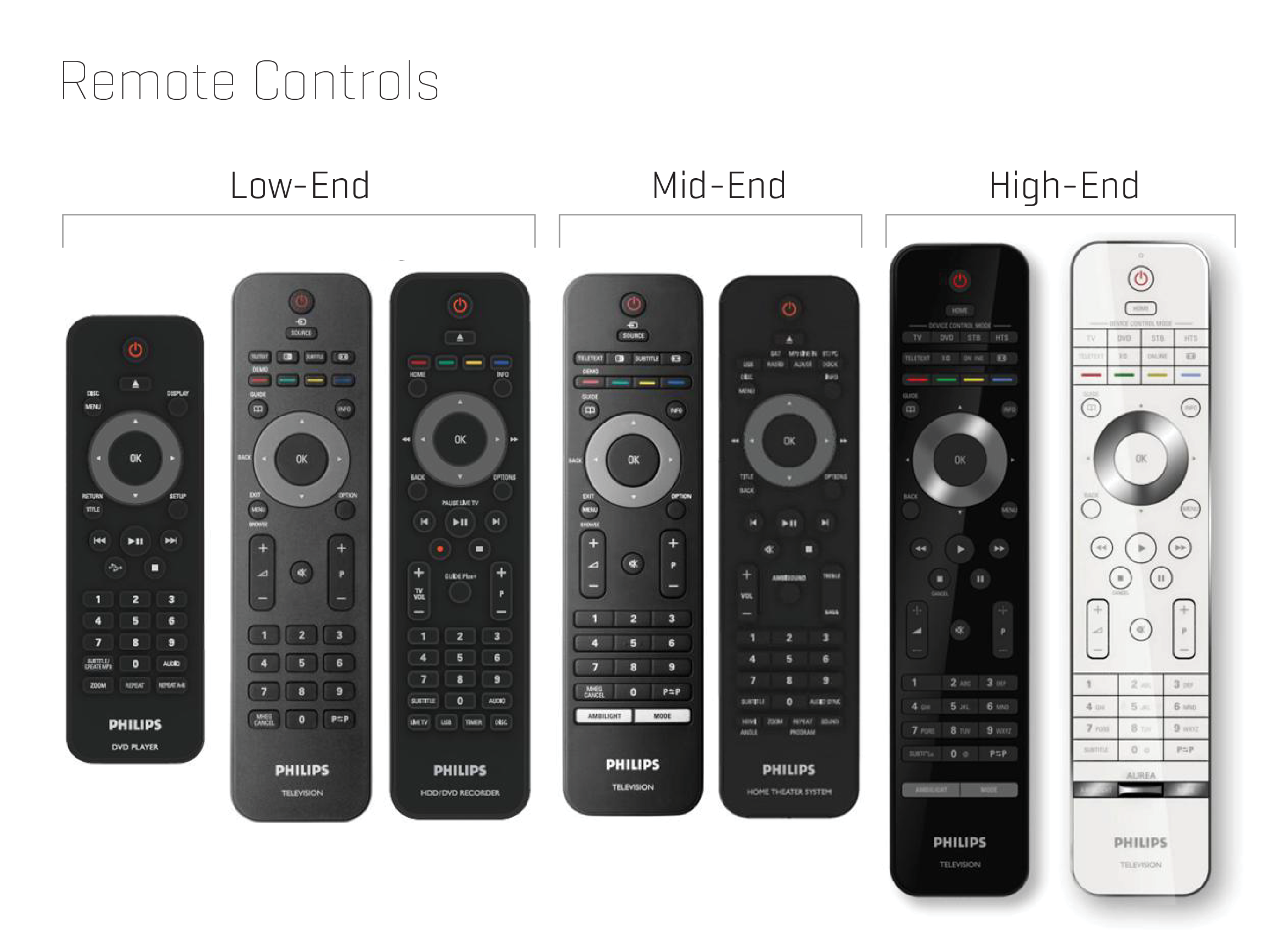
The business concern
The existing range of Philips remote controls were too intimidating.
- Too many buttons
- Heads-Down experience
- Memorization vs. Memorability
- Not enough consistency across different remotes
Cause
When I heard the business problem, my first question was "Why are these remotes designed like this?". To understand this, we talked to the product designers, engineers and product owners of these different products.
We learned that there was a direct connection between the user interface and the remote controls. Almost all these products had hierarchical navigation menu system. This allowed only a few key features to be easily accessible. Hence over a period of time, more and more buttons got added to the remote control to provide quick access to these deeply hidden features.
Voice of customers
To further understand the user's pain points, we conducted user interviews. We also reviewed a lot of user feedback that was already collected by different people in the field - Sales, Marketing etc. We identified the most painful feedbacks such as these:
"My main TV is connected to other devices, such as a DVD player, cable or set-top box, home theater or sound system, etc. I enjoy all of the different benefits and choices that each device provides. However, this can be cumbersome to use since every device has its own way of working, with its own menu and its own remote control. I wish all my devices could work together as one system, with one menu and one remote control."
"On my computer, I have quick and easy access to many programs, files, and other content. With my mouse, I can directly point and click on whatever I want, and I am almost instantly there. I expect that I will be able to do more things on my TV in the future. Currently, on the TV I am restricted to up/down left/right controls, which could become a limitation in ease of use. I wish I could choose my TV entertainment by simply pointing and clicking on what I want from the comfort of my couch."
Usability study sessions
Overall what the users were looking for:
Navigation
- Non-Hierarchical content organization.
- Reduce learning curve.
- Harmonized remote controls.
Functionality
- Easy access to key functionalities.
- Easily navigate Photos / Videos / Music.
- Quickly go back to what they were watching.
Aesthetics
- Pleasing to the eyes.
- Opaque UI interrupts the viewing experience.
- Should look and feel up-to-date.
Re-Inventing the entertainment UX
Our users were not thinking in terms of features, but their mental model was more focused around activities. They were talking in terms of: "I want to watch videos" or "I want to show birthday photos on a large screen" or "I want to improve the picture quality" (not increase contrast or brightness specifically)"
As part of the re-design efforts, we started breaking apart the experience into "activities" rather than "features". To understand the existing navigation structure, I laid out the entire hierarchical menu on a flat sheet of paper. This helped the team visualize how complex the menu system was. We also analyzed the frequency of use. For example, there were deeply hierarchical menu items like - Main Menu > Features > Auto-Lock > Lock Program which hardly anybody used, but if they needed to use, it was hidden 4 layers deep.
We then explored the possibility to re-group the menu items into activities rather than functions. With this exercise we were able to identify 5 key activities:
- PLAY - The most critical state that the users want to be in.
- BROWSE - Visually browse and find content.
- ORGANIZE - Ability to take control of organizing the content.
- LISTS - Certain types of content demanded simple lists.
- GRID - Structures content for easy findability.
Amongst these, the PLAY state was the most important. Most ot the users were saying that their main objective is to enjoy the content in a lean-back experience.
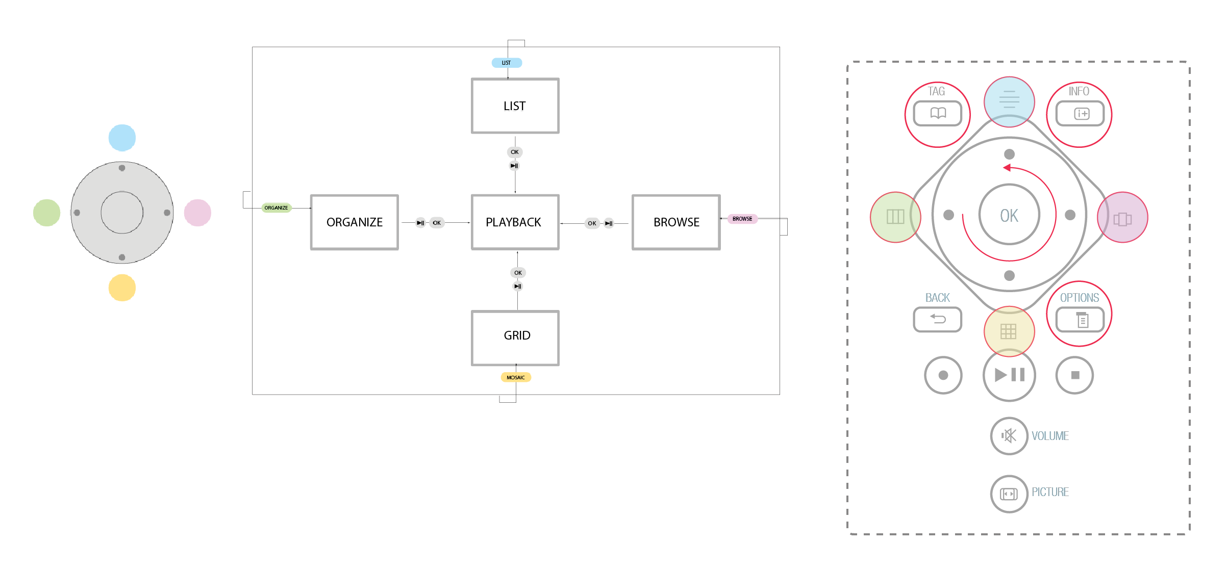
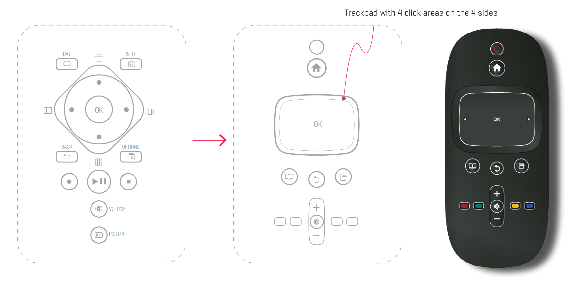
The Diamond Concept
Based on these findings, the team started exploring different ways in which we can re-construct the navigation system and content organization. After exploring a few options, the "Diamond Concept" turned out to be the most promising one.
This concept placed the Play State in the center and the 4 secondary activities were organized around the 4 directions. This allowed for a better memorability of the navigation. It also flattened a lot of nested navigation and brought the key functionalities up-front.
Even after doing this, we still had the need to place certain additional buttons on the remote - like Volume, Options, Play Controls, Info etc. (as shown in the image below)
One interesting aspect of this concept was the introduction of the rotary wheel in the center around the OK button. This wheel rotated, which eliminated the need to repeated clicking the directional button in the previous remotes.
At the same time, I was also staying connected with the industrial design team to understand the details of the rotary wheel and how responsive it is going to be. I borrowed a few test samples from the industrial design team and connected them to my laptop so that we can test the Flash Prototypes we were exploring.
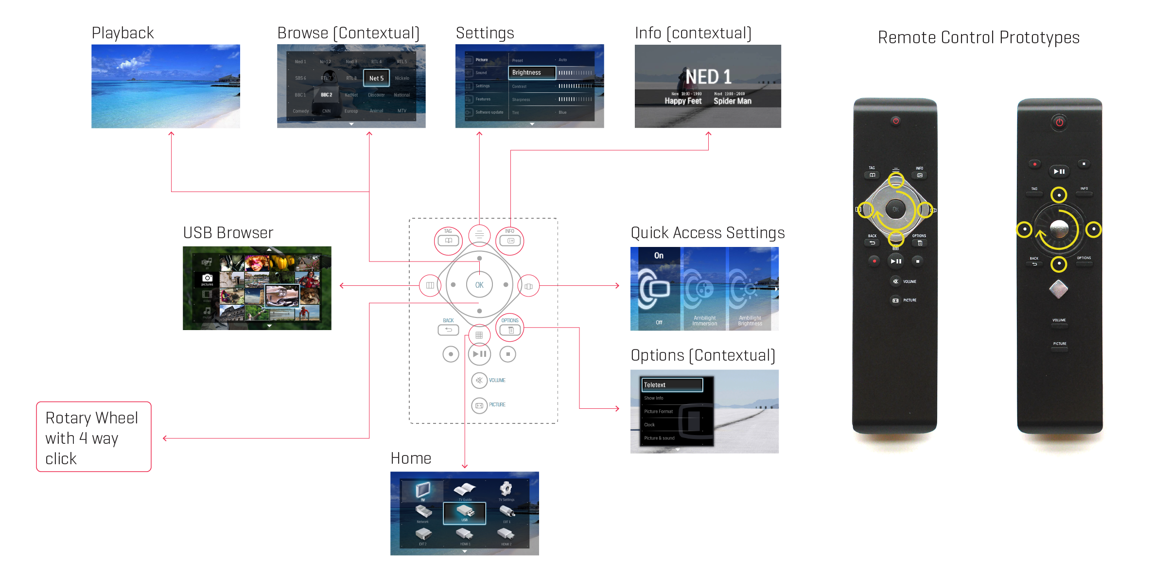
I took the diamond navigation concept and applied it to the TV UX and tried to see if it holds good.
For the design exercise, I mapped the corresponding features to the key activities:
- PLAY - The "Watch TV" screen.
- BROWSE - Quick access settings in a visual form.
- ORGANIZE - USB Browser.
- LISTS - Settings menu.
- GRID - Home Menu (Grid).
- OPTIONS - All the options were turned into contextual options.
Validation
Next step was to validate these designs with the users. We got a lot of positive feedback, but importantly we also received few negative feedbacks. This concept was not a runaway success. Which kind of surprised us too.
Some of the negative feedback we received was:
It's confusing / Difficult to grasp / Complicated
Ater carefully analyzing our approach, we figured out where we had gone wrong:
- End users not engaged enough during the design process.
- We made a lot of assumptions on the users behalf.
- We knew the system inside out, so it looked easy and intuitive to us.
- Rotary wheel behavior was not very obvious.
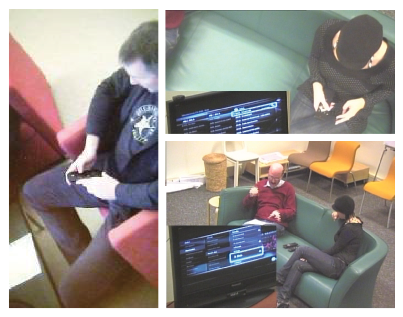
- User research was done in a controlled environment and not in users home setting.
Course Correction - 2.0
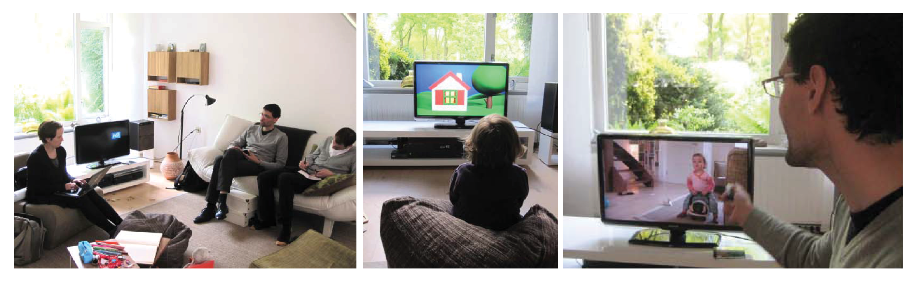
To increase customer engagement in the design process, I organized a team of designers, engineers, and Product owners to visit the homes of some of our users. I wanted to observe them in their environment. For the very first time, the engineers were able to see how their products were being actually used. We also asked the Philips shops to connect us with users who were buying these TV's. We wanted to observe how users setup the newly purchased products. These home observations revealed a lot of things which the team had not even thought about (like user-manuals were hardly used).
We also organized co-innovation workshops where the users were given a greater opportunity to bring their concerns to the table:
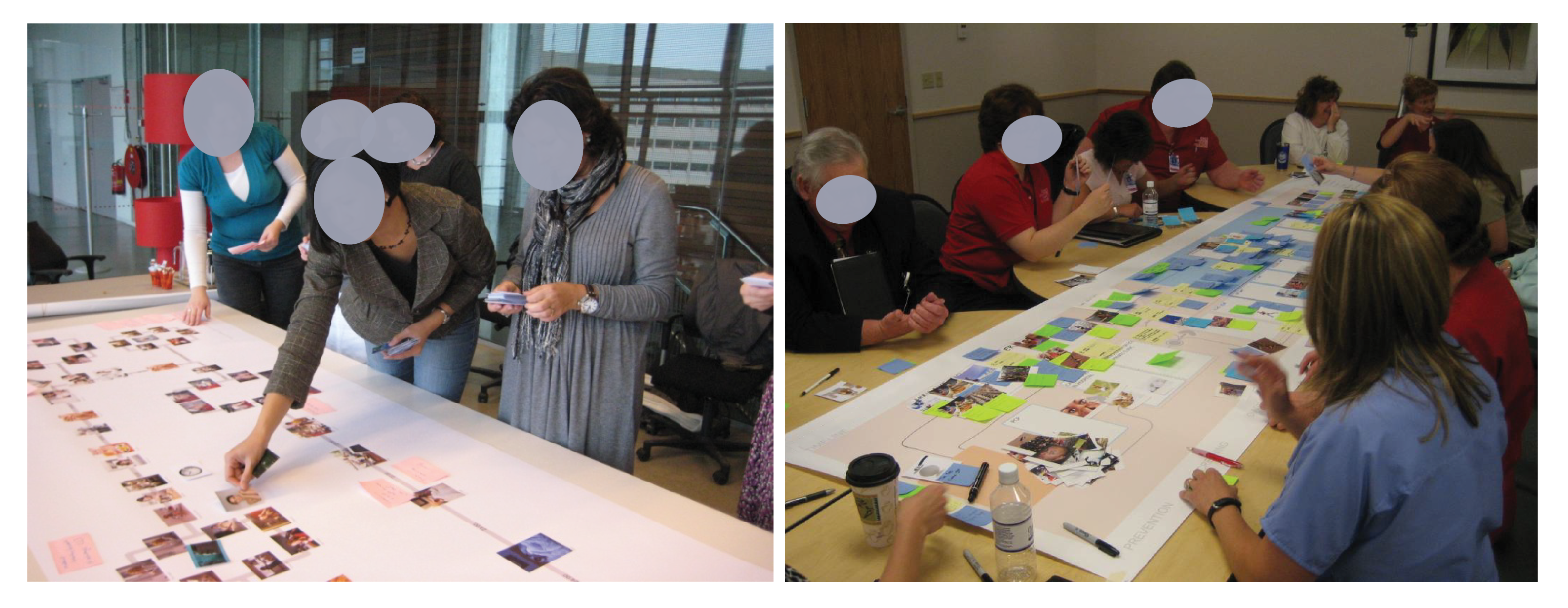
This lead to the creation of customer journey maps with their pain points and wishes:
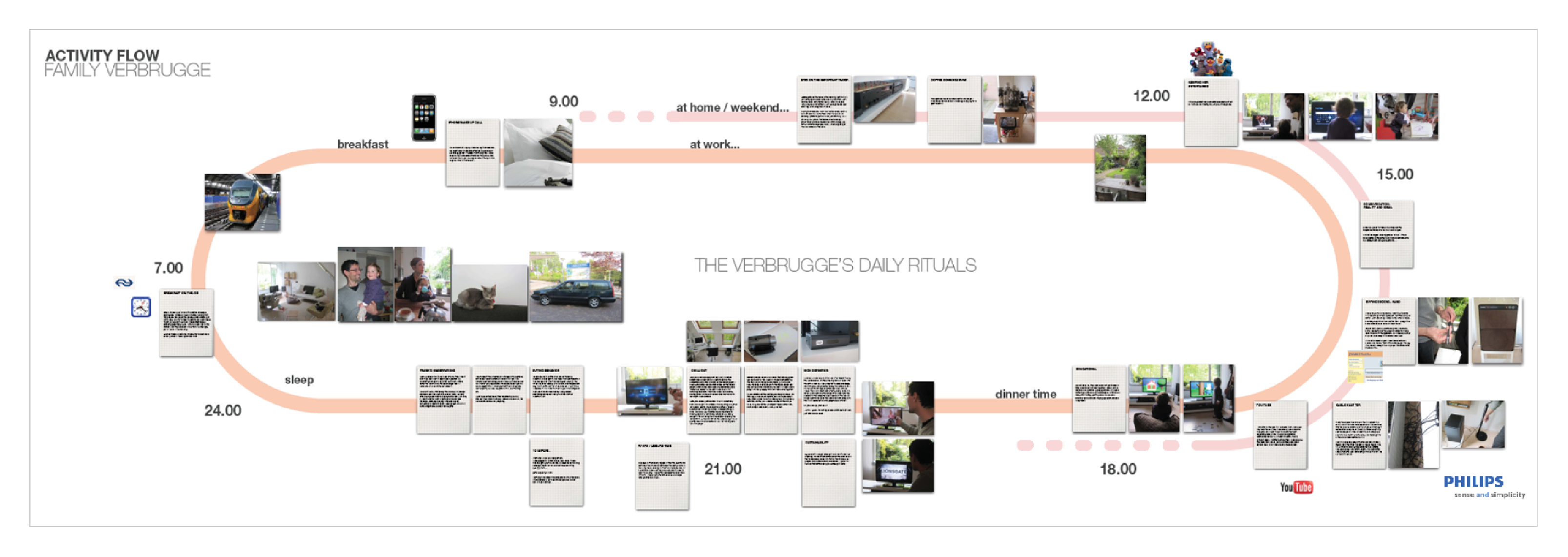
Through these studies, we were able to identify the values and attributes that the users cared about.
Intuitive
- Clear path to a goal
- Natural behavior
- Clean
Considerate
- Clear feedback
- Predictive
- Transparent
Focused
- Content-centric
- Relevant choices
- Appropriate metaphors
Well Built
- Orchestrated
- Authentic qualities
- Precise
- Responsive
Emotive

- Immersion
- Appealing to the senses
- Natural beauty of light
From Diamond to Track-Pad
One of the key take away from this study was that the remote control needs to be simplified even further. Not only that, a complementary user interface is also required which will provide the users a richer user experience.
To achieve further simplicity we discussed with the engineers if they can produce a track-pad based device. There was a lot of skepticism and push-back about this request. But since we had included some key stakeholders from the engineering team in our user-research process, they themselves became proponents of our demand and were able to push this effort into their already busy schedules. After a couple of trial and errors, the engineers were able to pull off this task and they said that this should be possible. Soon we embarked on designing the trackpad-based user interface.
Event Mapping
Now that we had a completely new interaction paradigm, we had to re-map all the key events and also define all the touch actions for the trackpad.
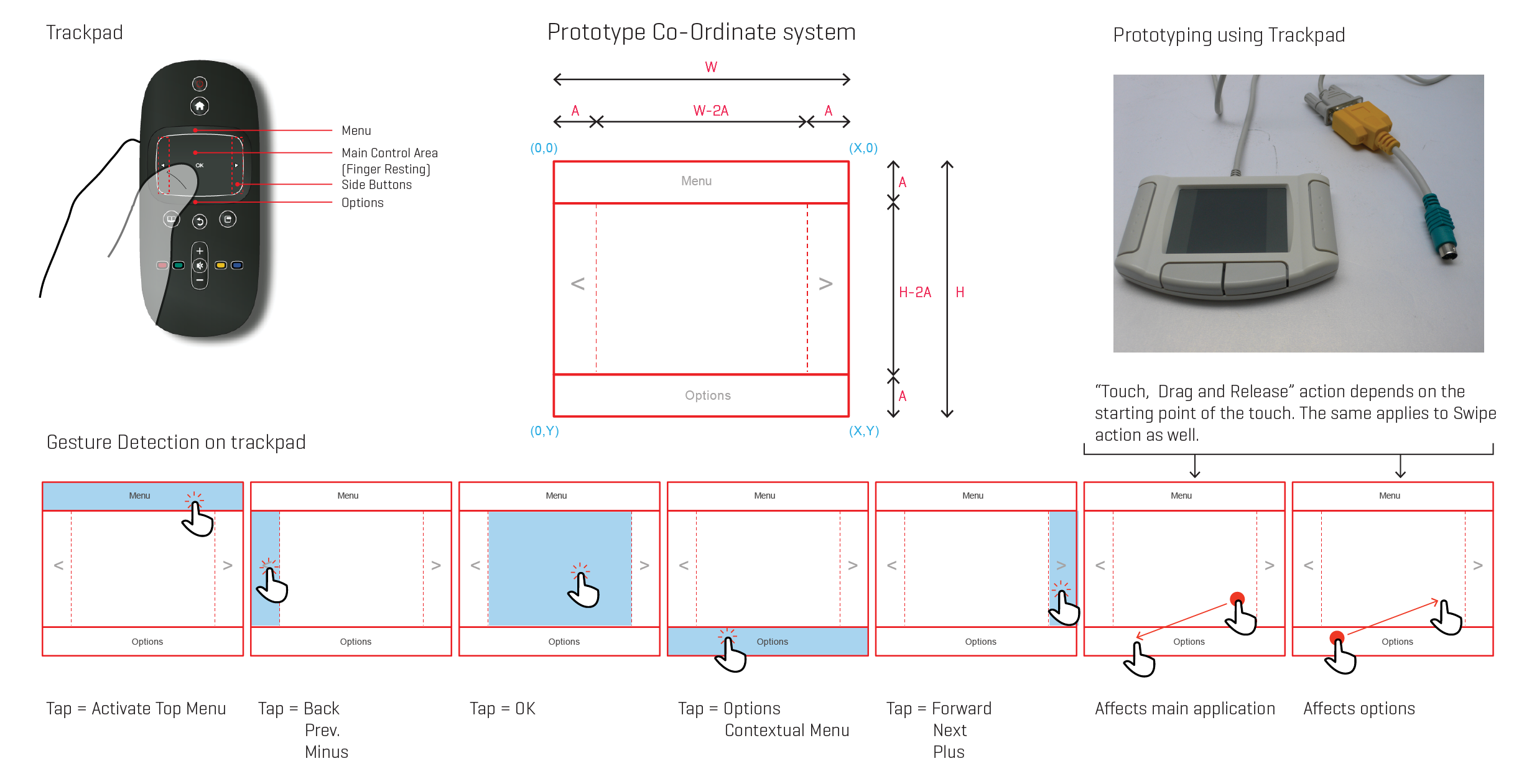
I got myself a USB trackpad and started playing with it. I connected it to my laptop and was able to monitor all the events. Once I got that working, I made a list of all the possible events that we could use:
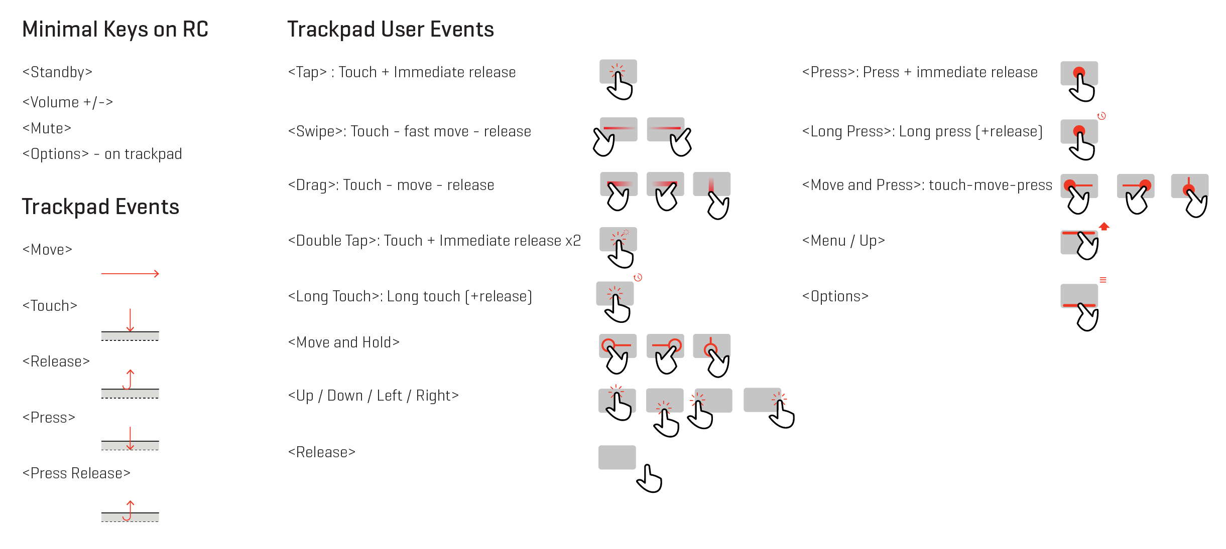
After identifying all the touch events, I started mapping out the effective 'touch zones' on the trackpad and associate them to each activity. This took a lot of trial and error. It also required me to make interactive Flash prototypes and test them with this trackpad.
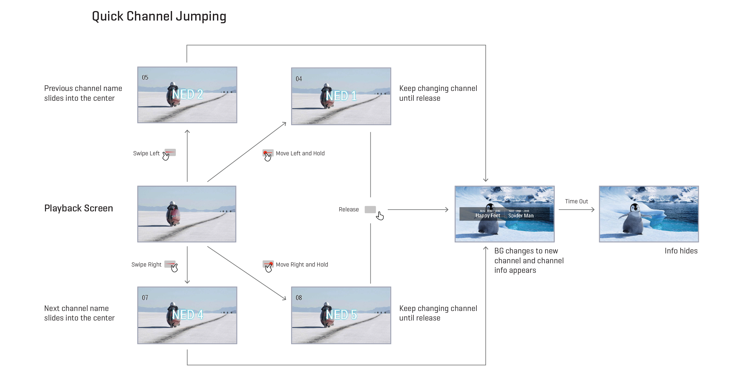
Navigation Design
The prototypes really excited the team and helped them understand the interaction possibilities with the track-pad. Once the events were mapped, the team started out defining the detailed interactions for each activity. Along with the high-level navigation, we also started thinking about contextual menus like Options Menu.
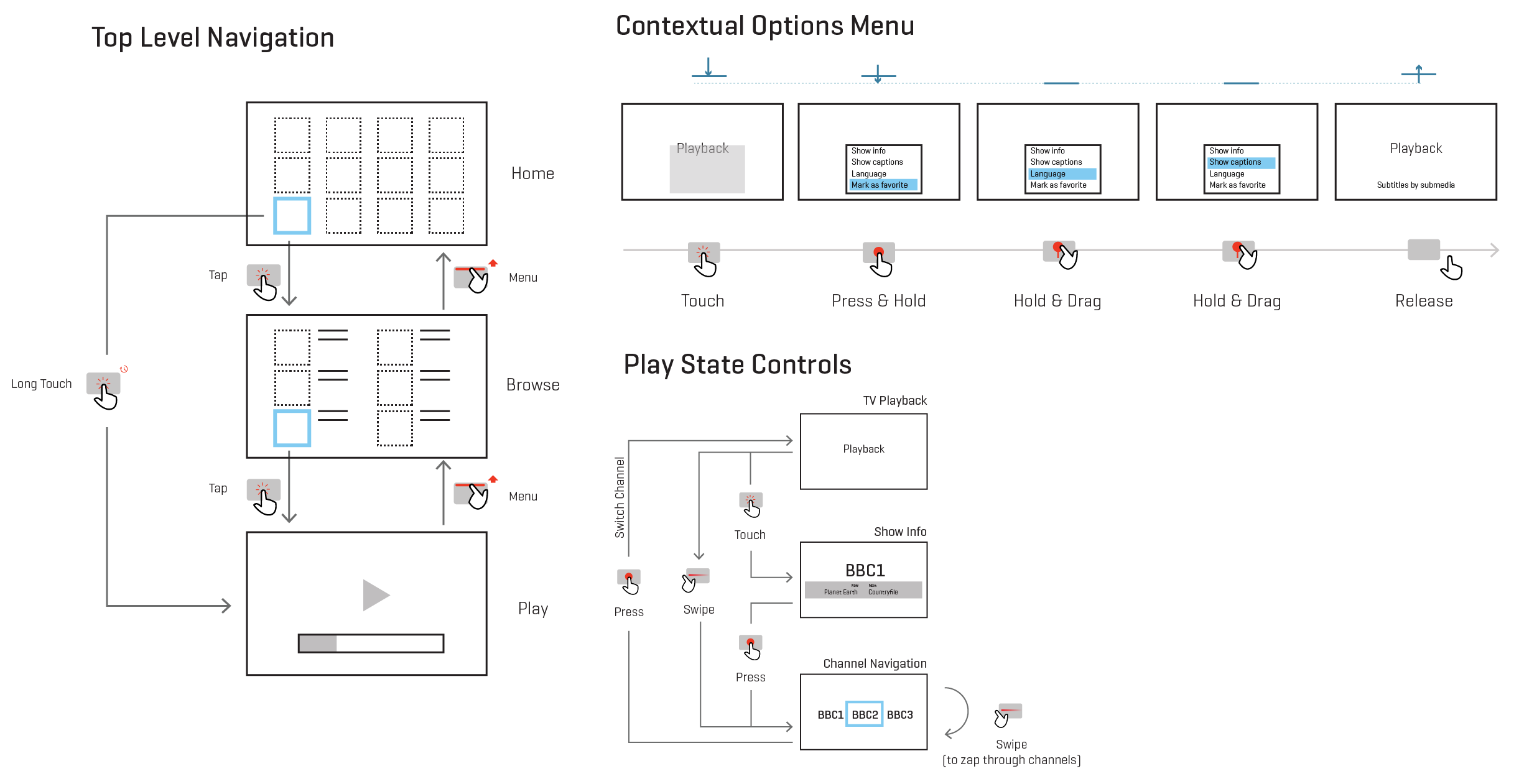
This solution was tested once again with the users and this time we got really great feedback. Since the users were already involved in the entire design process, they were easily able to understand the rationale behind the designs and most of the interactions came naturally to them. There were still a few issues identified which required further investigation, like the On-Screen play controls were seen as visual disturbance and the "swipe and hold" behavior was not very intuitive etc.
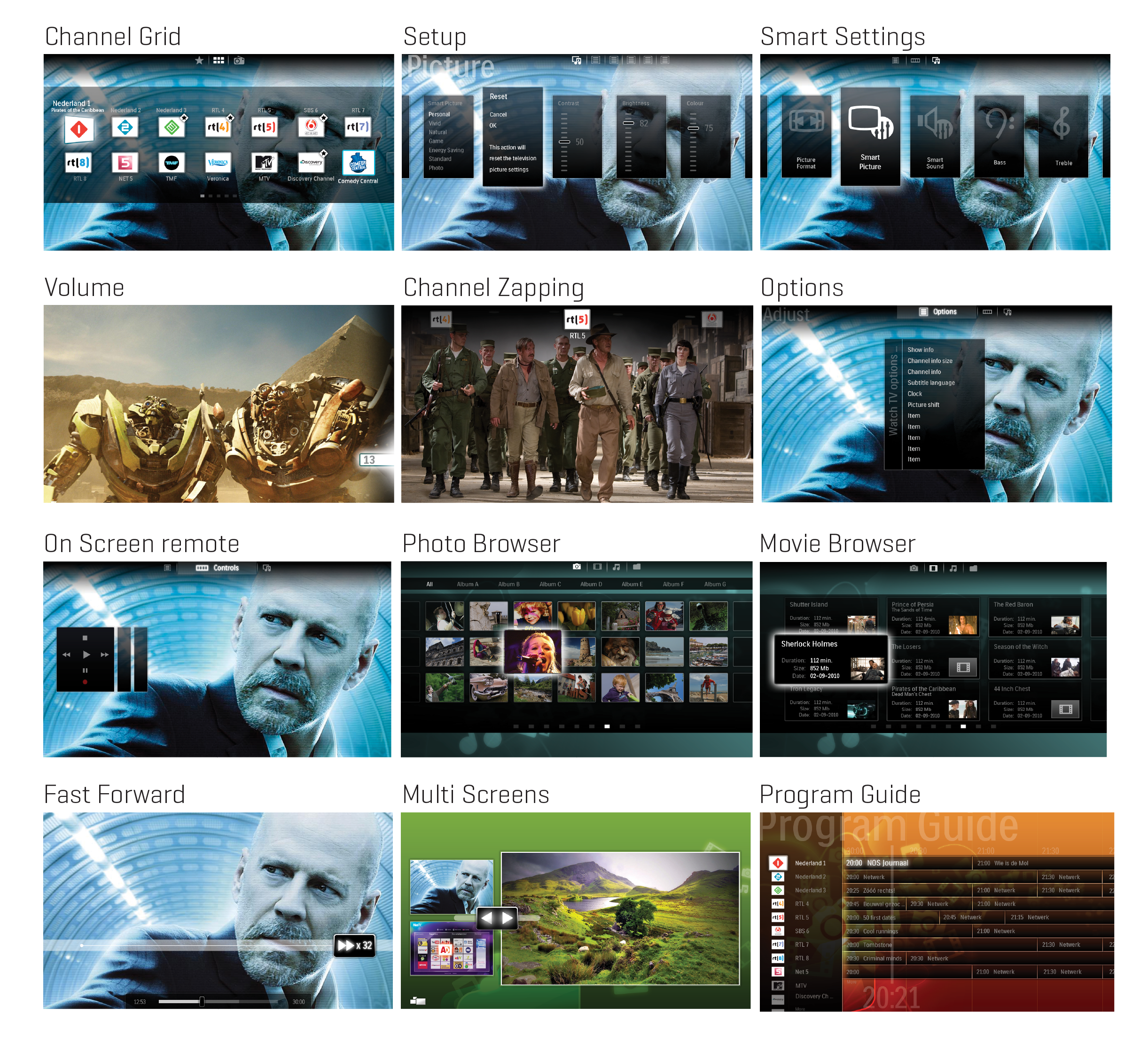
Visual Design
To support this remote, we also re-designed the user interface. Here are some visuals of the new design. Talking about the visual refresh would be a whole new project in itself :)
Lessons Learned
You get much deeper and clear insights when you observe the users in their familiar environment.
One of the failures we encountered in this projet was due to not investing enough time to study our users in their home environment (where they mostly use the products). This mistake got amplified in our design solution when we assumed those feedbacks to be valid.
Throughout this project, actively prototyping and validating concepts early helped us explore a lot of options. This helped us improve the quality of the solution.
Last but not the least, a very important realization was: