Dial-Pad re-design
(UX Research project)
(participate in the research by downloading the app and providing your inputs)
Download iOS app from iTunesWhy do we still use the old dial-pad layout on our phones?
“Time to re-think”
Have you ever wondered why the dial-pad on the mobile phones you use is laid out the way it is?
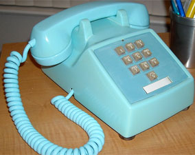
Long back in early 1960's Bell System did a research to come up with the dial-pad design for the push button phones (like the one you see in the image above). Until then people were either used to phones with rotary dials or they had used calculators (which has a completely different layout then phone keypads). I will not go into the details of that research, you can read it here.
We continued to use the same dial-pad layout, which seemed to have worked well until we started going super large screens on smart phones.
So I thought, is it not time that we question the use of this old dial-pad layout? Shouldn't we conduct a study to analyze the effectiveness of the current layout and compare it against possible new layouts?
Now all what I said above could be wrong or right, so I wanted to test my hypothesis by conducting this research and test multiple dial-pad layouts for touchscreen smart phones and see if my hypothesis holds true.
You can also participate in this study by downloading the app and submitting you results by testing these new dial-pad layouts.
Below you can find the live results from the study so far.
This research project is currently active and we are collecting the data, so feel free to participate.
Read detailed article on Medium
In this article I have described the problem in detail. This should give you a background of this study.
Read on MediumThe 5 proposed alternatives
To compare the effectiveness of existing dial-pad layout, I designed these 5 new layouts.
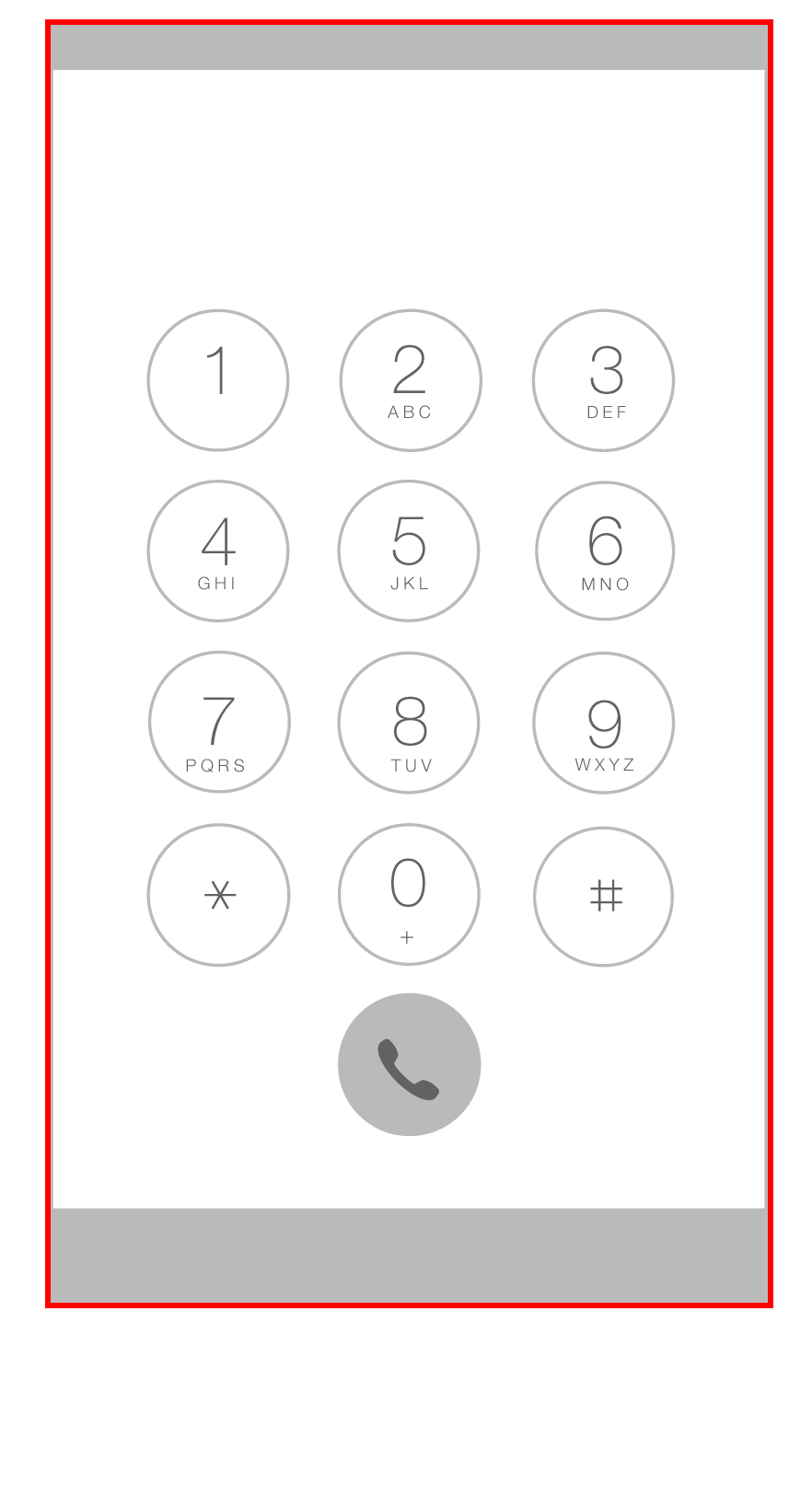
Current Design
This design uses the standard dial-pad layout in use since 1963.
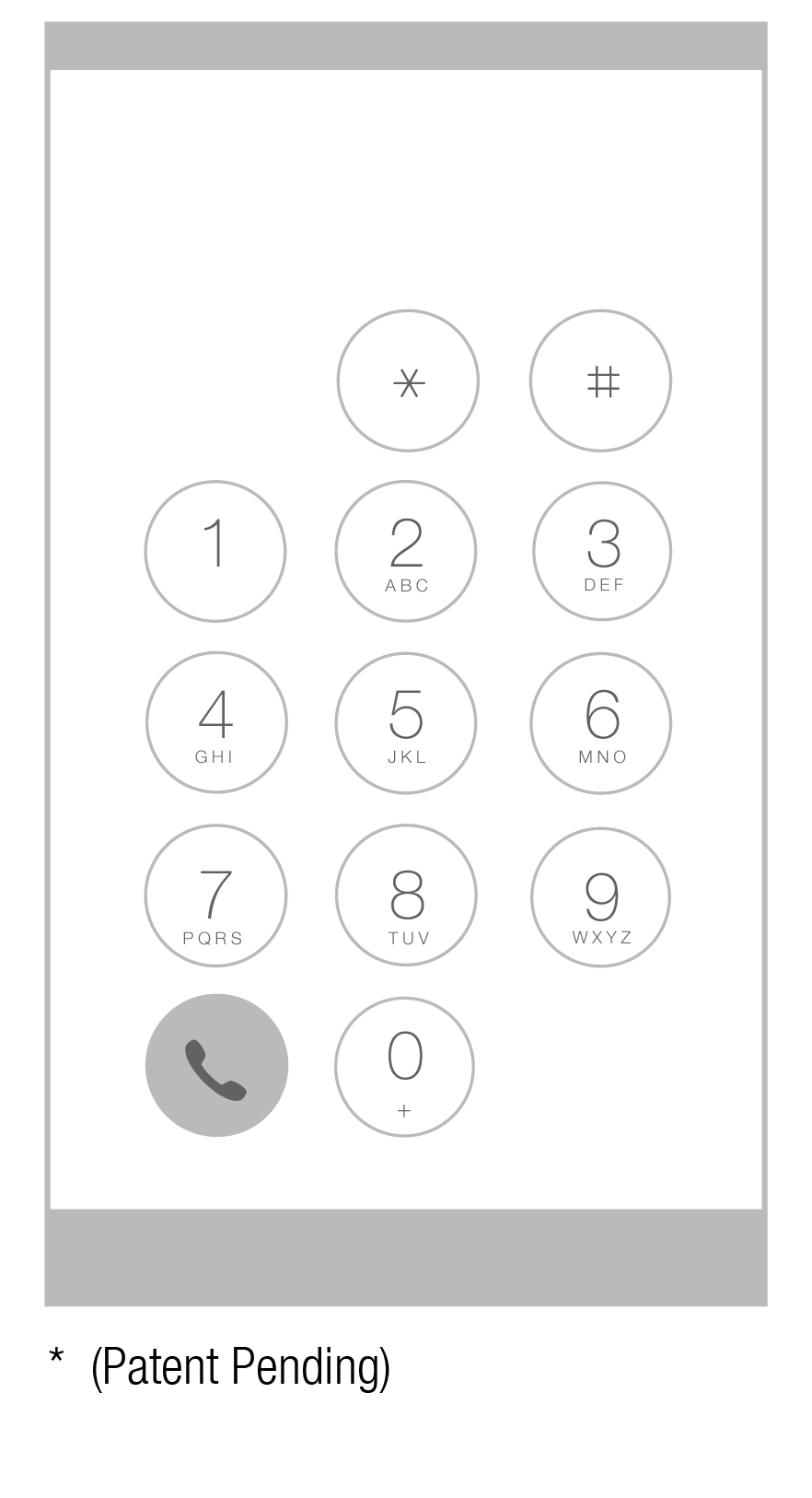
Concept-1
This design moves the number keys down by one row and shifts the Dial button to the left.
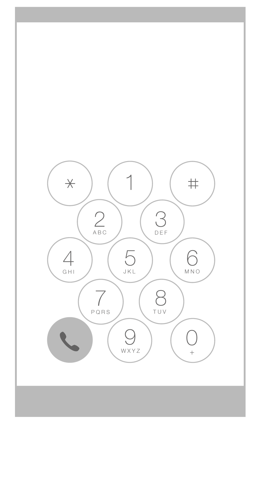
Concept-2
This design tries to further bring the keys closer together for ease of reach. It also arranges the rows of buttons in staggering order.
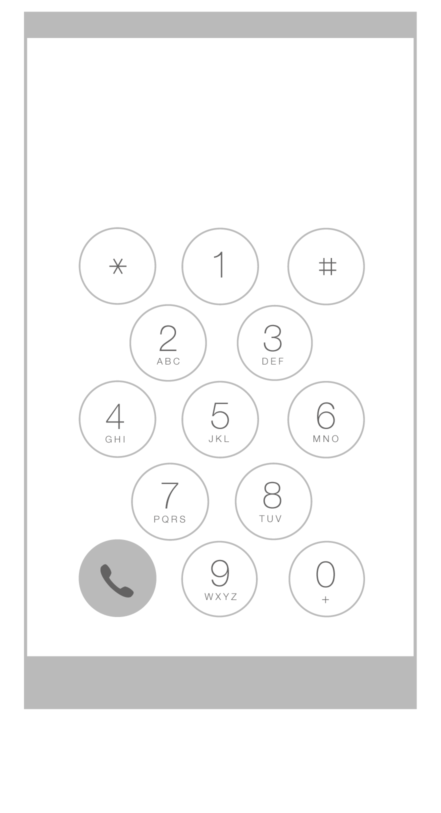
Concept-3
This design is similar to concept-2 but allows for a little more spacing between the buttons.
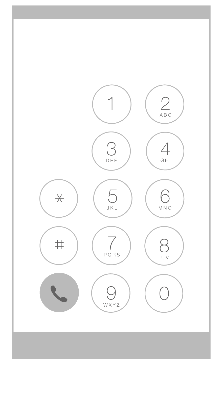
Concept-4
This design concept tried to bring the buttons closer to the right edge and avoid having numbers in the hard to reach zones.
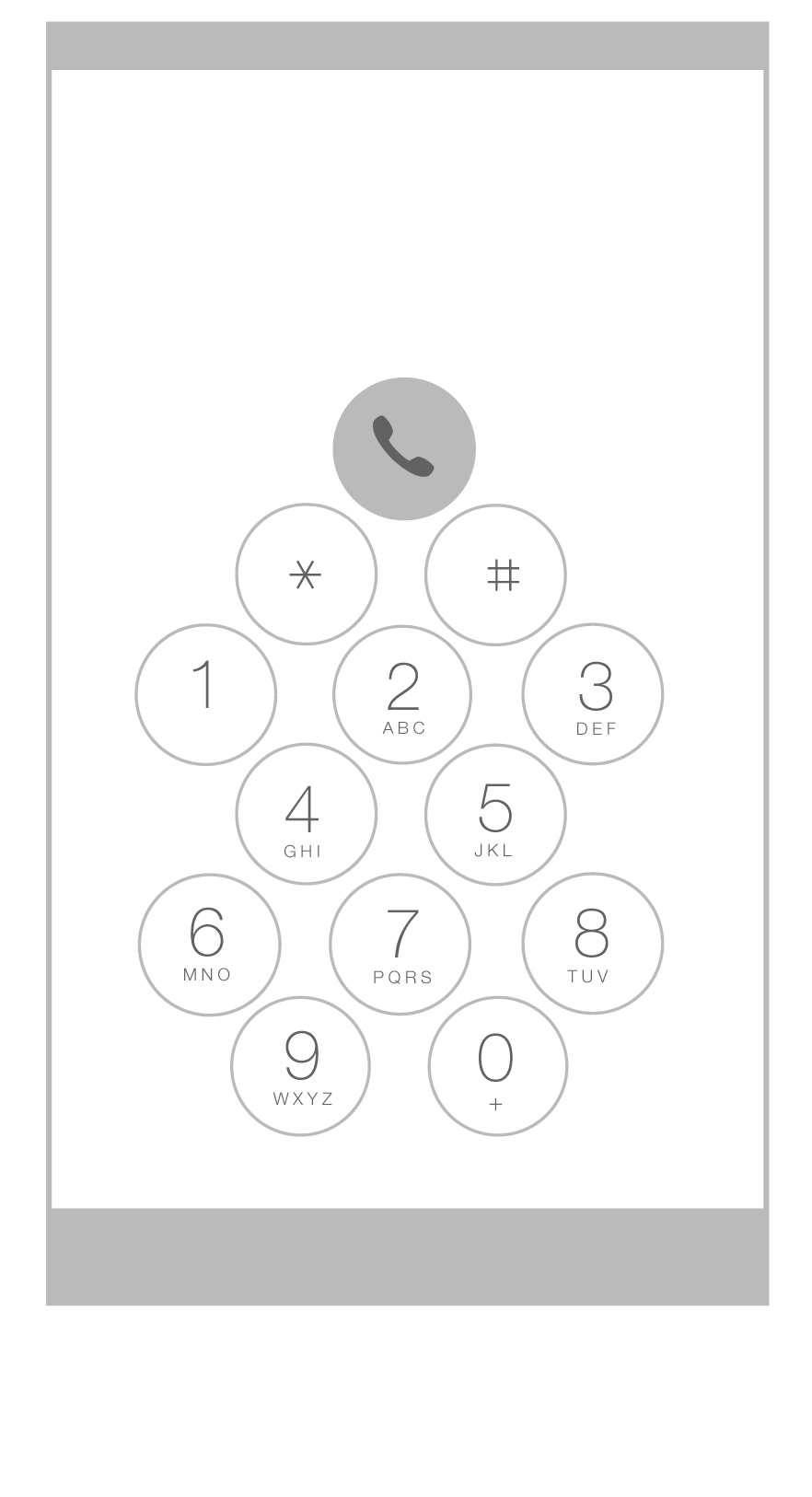
Concept-5
This is most unique layout with diagonal placement of buttons and moving the dial button to the top.
The Findings so far...
The charts below consolidates the inputs received so far and analyzes the effectiveness of the existing dial-pad layout in comparison to the 5 proposed new layouts.
Sets of sample data .... and counting
Overall best performance
seconds faster
than the existing layout.
Further analysis
Conclusion (so far)
Based on the findings so far, the is consistently performing faster compared to all other concepts (including the existing key layout) with substantial increase in the dialing speed across enthnicity, age groups and gender.